In regards to the elements of the design, there was a division between including the 'S' symbol in the word or not doing it. Some people mentioned that the rest of the text should be similar to the symbol. If the isotype is going to be part of the logotype it has to somehow stand out from the rest of the text and not be lost, as when isolated or working alone, would lose relevance. Others instead, commented on how good the typeface works and how stupid would be not to make the isotype part of the text, considering how predominant is the sound of the 'S' in the word Essence.

Most of the feedback is about adjusting parts of the design, what others like or don't, but there's some other that should be reflected here due to the nature of this brief.
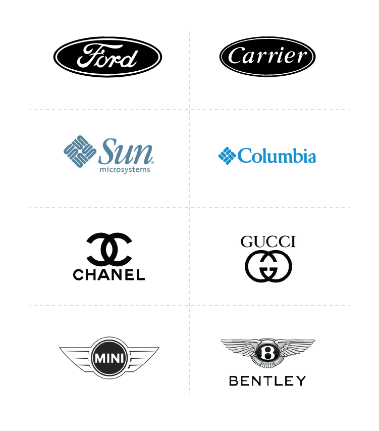
Someone also mentioned that the elements were not original and have been seen everywhere around. They made a good point comparing it with the brand TRESemmé and Nescafé for their similarities. What was said as a negative comment, I found it quite positive. Making a visual identity that relies on luxury (but accessible) and science, and looking like those companies that weren't contemplated in the research but have a similar approach was an indicator that someone was being done right. Moreover, when they are not competition of Essence.
The design was backed up with facts, like it needed to use simple shapes in order to be easily remembered as well as to stay familiar. It's a company that sells, in theory, air. So it has to feel familiar instead of something new that might scare the consumers. I also shown different examples of companies that have similar logos, even in the same industry and as competition, like the case of Mini and Bentley.
This started a debate about the importance of originality, to which I shared my personal point of view in regards to this topic summarised by Chris Do: "The idea of being original is both ignorant and arrogant. Ignorant, because you don't know what's come before. Arrogant, because you think it was all you". Then someone pointed out the importance of making a difference and standing out from the crowd. That person also highlighted how stupid was to create a visual identity of a brand that is not positioned in the market that it's not going to stand out. It was here when the research made for the dissertation became useful, because it allowed me to identify different concepts that were being mixed.
The person that made these comments didn't understand that Essence was not selling fragrances or cosmetics and secondly didn't understand what positioning was and the different strategies involved. To what I agree with is that canons must be challenged and knowing well a market helps in breaking the mold, like Apple did for example. But it's the values and the mission what is challenging in the market, like Volkswagen did with the Beetle with the famous slogan 'think small'. But that is not the case of Essence, because as explained before, the challenge is to sell nothing but values and emotions. The position of this company can't be treated as there is no position of an imaginary company. In any case, it has to be treated like a company that is to be released, and that's how this project has been tackled down. The visual identity must feel familiar for a company that sells air!
No comments:
Post a Comment