
The first step was to find a concept from the series that could be used for the purposes of these posters. The design process started with the idea of good and evil. This show challenges these concepts in such way that confuses the audiences in such way that good and evil become blurry and so the understanding of the world as we know it.
A widely known representation of good and evil is the Ying Yang symbol. By making one out of paint and letting paint mix would represent these antagonist concepts merging.


Another idea was to use a microscope image of the malaria virus as one of the most famous quotes of this show is "Cure malaria? Why do you want to cure malaria? Malaria is doing a great job, leave malaria alone". It is very controversial, striking and challenges what everyone thinks about diseases straight away. This quote is regarding the human kind and how we are becoming the virus of this planet, so one of the ideas was using the molecule of malaria as the brain of the vitruvian man, as it is the representation of the perfect human proportions and it can be extrapolated to what we consider the perfect morals.

There also was an idea of using "malaria sweets" or Janus (the name of the molecule that comes next) sweets as a dark humorous way (a tone of voice they already use in the show) to show how a disease can be spread.

The idea that was taken forward for reasons that are going to be explained later, was to use the diagram of the molecule of a virus that is in the show and mixing this with one of the most famous scenes of the show, where one of the characters is tortured with bleach, sand, chilli and a spoon (warning: graphic content). There's also a dead mosquito in the poster that represents the controversial quote about the Malaria.


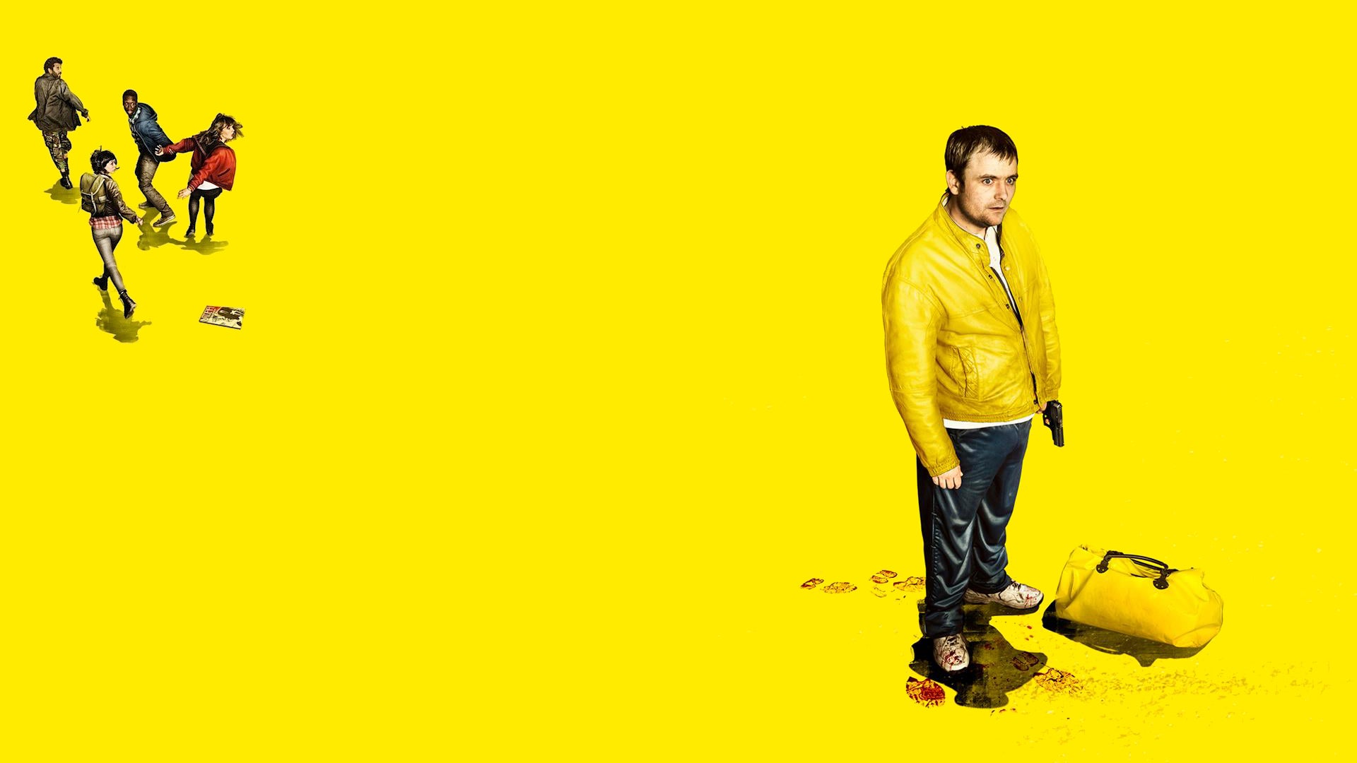
The three different concepts could work equally well for an animation. But for a still image that has to show the names of the cast in a compressed way it would probably smart to choose the one that could work along with the design. Unlike the Lost poster, in this one the design will integrate everything and make the names part of it. To do this, the idea was to use a notebook style (as the comic actually hides the notes of a scientist), similar to the comic in the series. The background was kept yellow but with the texture of an old notebook. A similar typeface is "Daniel", which has been used for the design.

Genghis Khan was also added, to fill a gap, as there's a similar quote about him as there is about the Malaria.


To make it deeper each name has a function or a little illustration on a side to give the audiences a clue which actor is who, like if they were reminders for who wrote it. Like if everything was part of a plan (which in fact is).
No comments:
Post a Comment