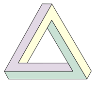
In this show there are several main elements: the airplane, the jungle, the island, etc that work as contexts of those paradoxes.
The paradox can be created with a context of nature, a natural uncontrollable force (which is the island and all that it involves) and the humans as intruders (Dharma). This contradictions can be represented through typeface, stock, etc. That feeling of "this doesn't belong here" like it happens through the series is what the design intends to convey. Although, this shouldn't affect the consistency of the design. There needs to be a visual harmony and aesthetic too. Maybe making a jungle look like it's made of electromagnetism (an element that plays a great role in the series) will show different elements of the series working together creating a visual paradox. Or maybe just the electromagnetic waves as a metaphor of what the island is.
Here's a tutorial of how to make these waves in photoshop. It's interesting to see how this kind of effect has been used with tunnels to represent time travelling in different games and movies, which is also something that happens in the series:

Other considerations:
Dharma designs
Dharma designs

Polar bear in the jungle

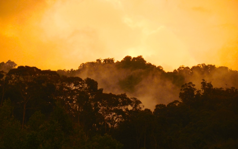
Jungle on a island (2 layers of forest):

The first approaches were geometrical and trying to include these waves in such way that conveyed an anomaly related to energy in a place.


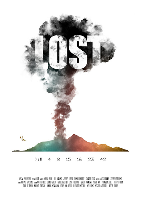
Trying to find a type of mysterious energy fit in the shape of the island the design seemed to work with the background of a nebula: a metaphor of everything we don't know about, the mysteries of the universe. I made a nebula following this youtube tutorial.
I added smoke to the island (the black smoke is one of the most important features of the show if not the most) and the airplane crashing. The texture of the nebula fades out towards the top of the smoke cloud, showing that not everything about this island is beautiful and marvelous. The island also fades out a little on the bottom to make an effect like it's merging with the sea.
In this poster, the title is interacting with the illustration in the same way credits could be interacting with animation in title sequences. The still image limits the design and pushes the names of the cast out of the smoke. Someone suggested to include the names of the cast in the smoke as well, but it would result on a congested design. The whole poster could be covered in black smoke with the names popping out here and there, but that would make the concept much more simpler.
The white background allows the design to standout more with its different colours as well as giving a sense of isolation of the concept.
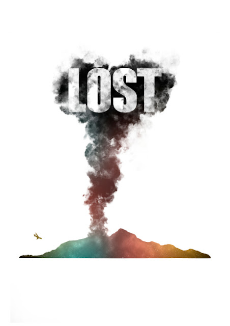
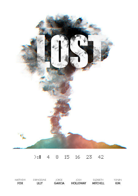
I also added those numbers right below the island as they play an important role in Lost. The typeface for the title is the same as the original series (there's no reason to change it for the purposes of this design) and the one used for the numbers is "ScreenMatrix", a typeface that reflects very well the aesthetics of old DOS systems (also related to the plot, as these numbers had to be introduced in an old computer).
The type used for this example for the names has a very standard film context, which is probably not what it should be considering that this poster is about title sequences.
Nevertheless, as pointed out before, using this concept in an animation names could be easily used in the smoke, so it seems pointless to try to drag the attention from the smoke in the poster. Also, what is important in a poster like this is the title of the show. So then, the names of the cast are included using a typeface (Futura) that denotes rationality and civilisation in opposition to what the island represents. This kind of typography is also used in Dharma packaged products in the show. In order to take the concept further and to enrich this "conceptual animation" the design is added an effect of electromagnetic interference, which is also a very important aspect of these series. This is done by distorting the illustration and giving some slight chromatic aberration to it. The thin lines are there to convey a kind of old CTR monitor, as one of the ways the main characters learn about the secrets of this island through VHS tapes.
Someone told me that it's confusing to see the airplane that is about to crash and the smoke coming out like that. That is also done on purpose to enhance the confusion and to challenge the logic in a very simple way.


Trying to find a type of mysterious energy fit in the shape of the island the design seemed to work with the background of a nebula: a metaphor of everything we don't know about, the mysteries of the universe. I made a nebula following this youtube tutorial.
I added smoke to the island (the black smoke is one of the most important features of the show if not the most) and the airplane crashing. The texture of the nebula fades out towards the top of the smoke cloud, showing that not everything about this island is beautiful and marvelous. The island also fades out a little on the bottom to make an effect like it's merging with the sea.
In this poster, the title is interacting with the illustration in the same way credits could be interacting with animation in title sequences. The still image limits the design and pushes the names of the cast out of the smoke. Someone suggested to include the names of the cast in the smoke as well, but it would result on a congested design. The whole poster could be covered in black smoke with the names popping out here and there, but that would make the concept much more simpler.
The white background allows the design to standout more with its different colours as well as giving a sense of isolation of the concept.

I also added those numbers right below the island as they play an important role in Lost. The typeface for the title is the same as the original series (there's no reason to change it for the purposes of this design) and the one used for the numbers is "ScreenMatrix", a typeface that reflects very well the aesthetics of old DOS systems (also related to the plot, as these numbers had to be introduced in an old computer).
The type used for this example for the names has a very standard film context, which is probably not what it should be considering that this poster is about title sequences.

Nevertheless, as pointed out before, using this concept in an animation names could be easily used in the smoke, so it seems pointless to try to drag the attention from the smoke in the poster. Also, what is important in a poster like this is the title of the show. So then, the names of the cast are included using a typeface (Futura) that denotes rationality and civilisation in opposition to what the island represents. This kind of typography is also used in Dharma packaged products in the show. In order to take the concept further and to enrich this "conceptual animation" the design is added an effect of electromagnetic interference, which is also a very important aspect of these series. This is done by distorting the illustration and giving some slight chromatic aberration to it. The thin lines are there to convey a kind of old CTR monitor, as one of the ways the main characters learn about the secrets of this island through VHS tapes.
Someone told me that it's confusing to see the airplane that is about to crash and the smoke coming out like that. That is also done on purpose to enhance the confusion and to challenge the logic in a very simple way.

No comments:
Post a Comment