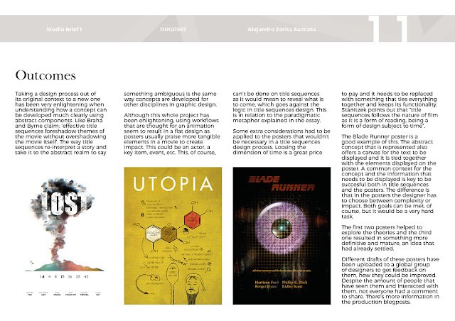
This is the proposal for COP3. The ISSUU document is embedded. In the case of malfunction please follow this link: https://issuu.com/az257592/docs/issuu
Please, use full screen and zooming tools for a better reading.
Saturday, 15 April 2017
Wednesday, 12 April 2017
Tuesday, 11 April 2017
Desigining the posters - Blade Runner
With the first two designs it was proved that for the compression of title sequences in the form of a poster any concept in the movie that is taken to the abstract can work just fine. The design for this poster of the movie Blade Runner wants to challenge that, so instead of trying different ideas only one is going to be explored.

The design is going to be about one famous quote that takes place in this movie: “Attack ships on fire off the shoulder of Orion. I watched c-beams glitter in the dark near the Tannhäuser Gate. All those moments will be lost in time, like tears in rain.” As tears is a concept linked to eyes, the idea is to show the eye like in the tests the replicants were subjected and somehow putting that into the context of the quote.

There's also a philosophical question that the film leaves at the end. Why the human kind would take the liberty of discriminating a being just because they created it? If humans creates something that understands and feels love, why is it not real love? This is an amazing aspect of this movie and the design will reflect it by that mixture of technology (computer), physiology (eye) and experience/feelings (contemplating the stars).
So the first thing that needed to be illustrated was the eye. Several photographs were taken and other one used from internet to try to make it work.


It was then when this tutorial was found and used to make the iris of an eye. After a few tests, the final version of the eye was ready.


Replicants were known in Blade Runner for doing jobs that human beings wouldn't like to do like, for instance, space exploration or going to war. In the quote, Roy, the replicant, mentions the shoulder of Orion. Now this is not as recognisable as the Orion belt, so the design has the Orion belt on the eye as something he has seen. The eye was combined with a grid and a texture of old TV (to match that futuristic look of the 80's) as if the eye is being scanned. This mixed with a public domain picture of a window with rain drops and city lights in bokeh gave the following result (the colours were modified for aesthetic reasons). The background is black so the eye look like is coming out from the darkness.


As mentioned with the other posters, there's no reason to change the original design of the title for the purposes being explored in this project. At first, it was only used the name of the actor that portrayed the character that made that specific statement. This could work on a title sequences or a series of posters for Blade Runer where only the eye of the person behind the name that is being shown. But as this intends to be a compressed version of the title sequences, there were added more names.
The typeface used is Garamond Premier Pro Medium Caption as it has the right thickness that almost matches the typeface that appears in the computers in the movie. Also, the quote was eventually added as it could be a line that could be potentially be crossed on the design of a poster but it couldn't in a title sequences, something that is very interesting considering that until now that's the only space the design can expand to considering the limitations.
The title was also modified a bit to balance the design. The rest of the colours were chosen according colour theories to give a sense of futurism


The design is going to be about one famous quote that takes place in this movie: “Attack ships on fire off the shoulder of Orion. I watched c-beams glitter in the dark near the Tannhäuser Gate. All those moments will be lost in time, like tears in rain.” As tears is a concept linked to eyes, the idea is to show the eye like in the tests the replicants were subjected and somehow putting that into the context of the quote.

There's also a philosophical question that the film leaves at the end. Why the human kind would take the liberty of discriminating a being just because they created it? If humans creates something that understands and feels love, why is it not real love? This is an amazing aspect of this movie and the design will reflect it by that mixture of technology (computer), physiology (eye) and experience/feelings (contemplating the stars).
So the first thing that needed to be illustrated was the eye. Several photographs were taken and other one used from internet to try to make it work.


It was then when this tutorial was found and used to make the iris of an eye. After a few tests, the final version of the eye was ready.


Replicants were known in Blade Runner for doing jobs that human beings wouldn't like to do like, for instance, space exploration or going to war. In the quote, Roy, the replicant, mentions the shoulder of Orion. Now this is not as recognisable as the Orion belt, so the design has the Orion belt on the eye as something he has seen. The eye was combined with a grid and a texture of old TV (to match that futuristic look of the 80's) as if the eye is being scanned. This mixed with a public domain picture of a window with rain drops and city lights in bokeh gave the following result (the colours were modified for aesthetic reasons). The background is black so the eye look like is coming out from the darkness.


As mentioned with the other posters, there's no reason to change the original design of the title for the purposes being explored in this project. At first, it was only used the name of the actor that portrayed the character that made that specific statement. This could work on a title sequences or a series of posters for Blade Runer where only the eye of the person behind the name that is being shown. But as this intends to be a compressed version of the title sequences, there were added more names.
The typeface used is Garamond Premier Pro Medium Caption as it has the right thickness that almost matches the typeface that appears in the computers in the movie. Also, the quote was eventually added as it could be a line that could be potentially be crossed on the design of a poster but it couldn't in a title sequences, something that is very interesting considering that until now that's the only space the design can expand to considering the limitations.
The title was also modified a bit to balance the design. The rest of the colours were chosen according colour theories to give a sense of futurism


Desinging the posters - Utopia
Utopia are a TV series. The plot orbits around a comic that is more than just a comic, but the notes of a scientist that are not entirely clear. The branding of this series is very iconic, using a very bright yellow with white typography in Futura. These is some of the original content:
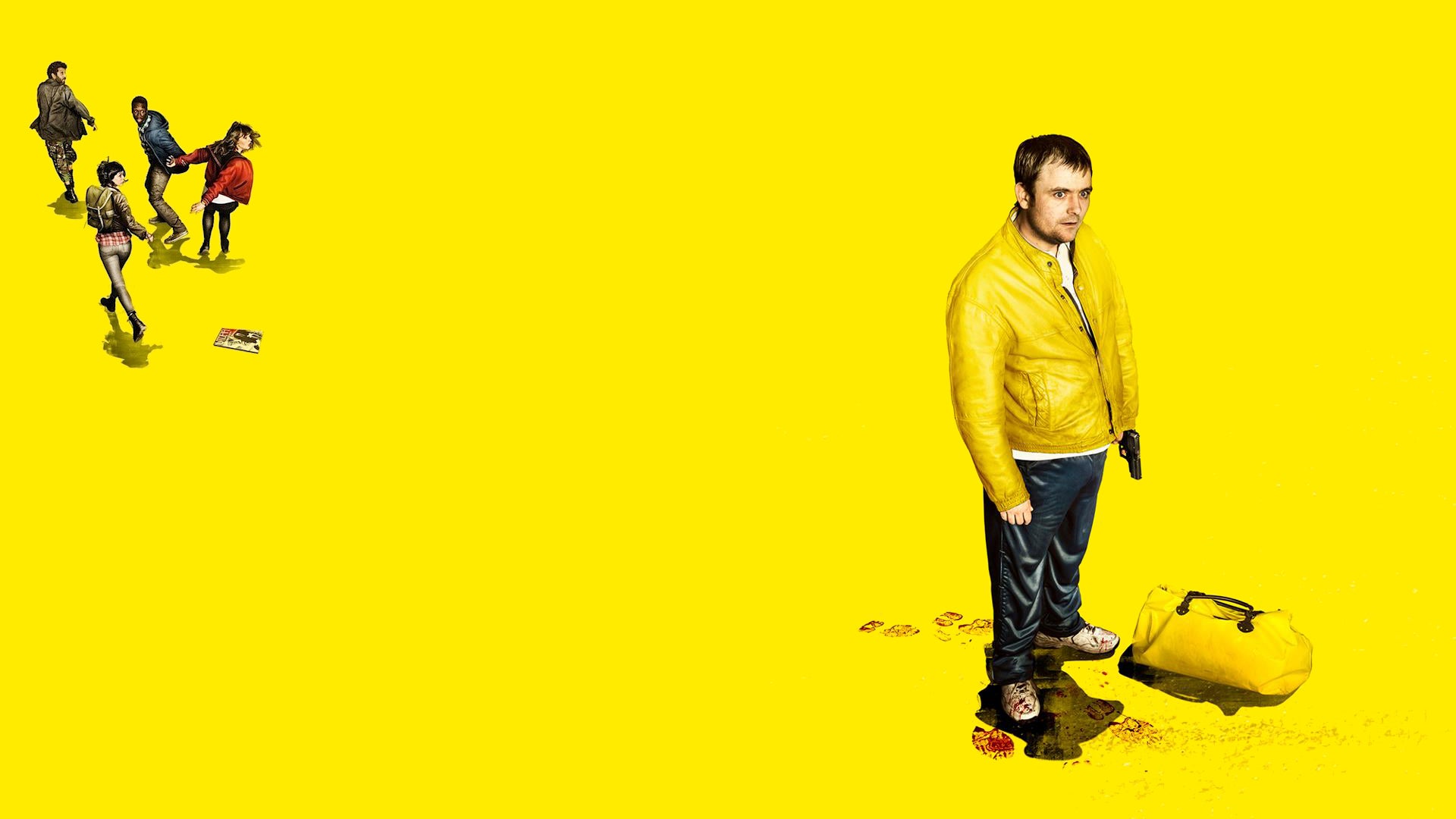

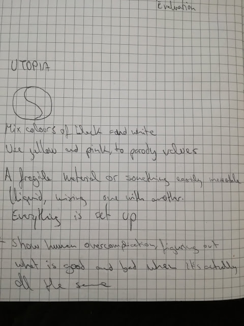
The first step was to find a concept from the series that could be used for the purposes of these posters. The design process started with the idea of good and evil. This show challenges these concepts in such way that confuses the audiences in such way that good and evil become blurry and so the understanding of the world as we know it.
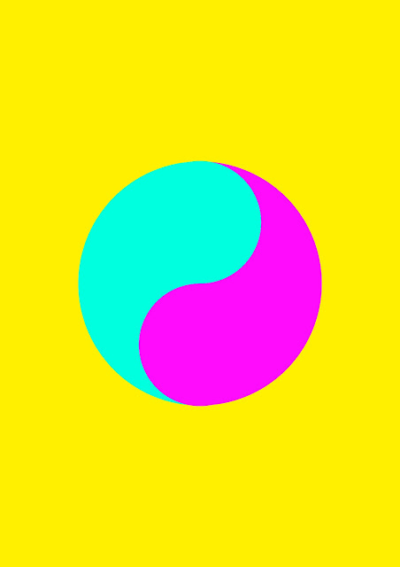
A widely known representation of good and evil is the Ying Yang symbol. By making one out of paint and letting paint mix would represent these antagonist concepts merging.
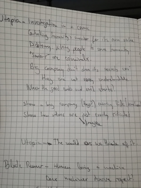
Another idea was to use a microscope image of the malaria virus as one of the most famous quotes of this show is "Cure malaria? Why do you want to cure malaria? Malaria is doing a great job, leave malaria alone". It is very controversial, striking and challenges what everyone thinks about diseases straight away. This quote is regarding the human kind and how we are becoming the virus of this planet, so one of the ideas was using the molecule of malaria as the brain of the vitruvian man, as it is the representation of the perfect human proportions and it can be extrapolated to what we consider the perfect morals.


There also was an idea of using "malaria sweets" or Janus (the name of the molecule that comes next) sweets as a dark humorous way (a tone of voice they already use in the show) to show how a disease can be spread.

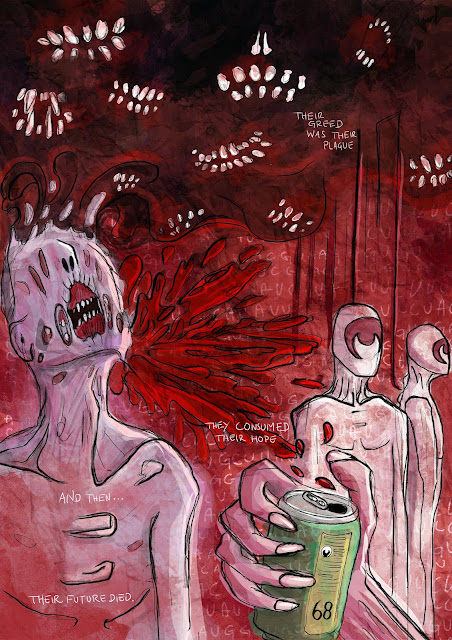
The idea that was taken forward for reasons that are going to be explained later, was to use the diagram of the molecule of a virus that is in the show and mixing this with one of the most famous scenes of the show, where one of the characters is tortured with bleach, sand, chilli and a spoon (warning: graphic content). There's also a dead mosquito in the poster that represents the controversial quote about the Malaria.

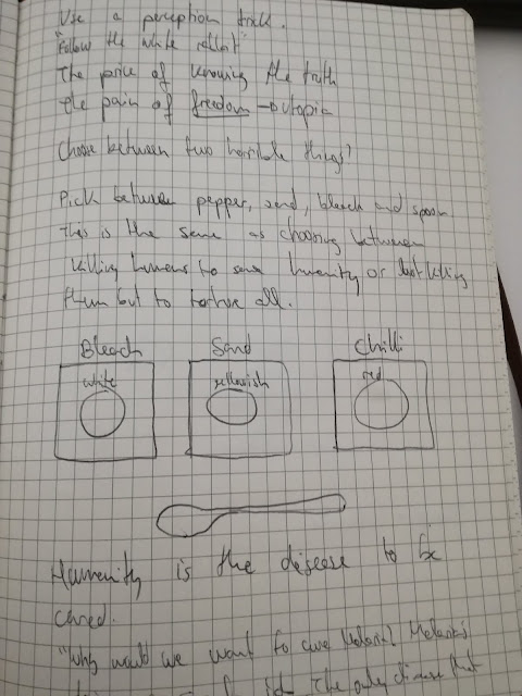

The three different concepts could work equally well for an animation. But for a still image that has to show the names of the cast in a compressed way it would probably smart to choose the one that could work along with the design. Unlike the Lost poster, in this one the design will integrate everything and make the names part of it. To do this, the idea was to use a notebook style (as the comic actually hides the notes of a scientist), similar to the comic in the series. The background was kept yellow but with the texture of an old notebook. A similar typeface is "Daniel", which has been used for the design.
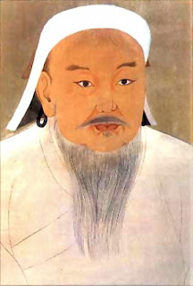
Genghis Khan was also added, to fill a gap, as there's a similar quote about him as there is about the Malaria.
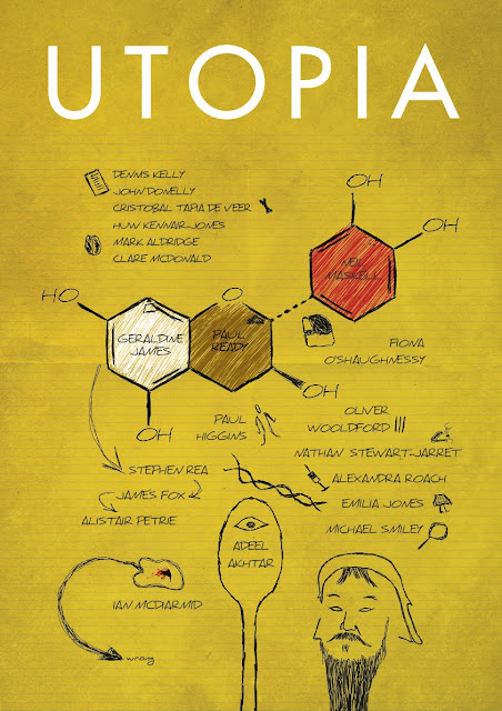
To make it deeper each name has a function or a little illustration on a side to give the audiences a clue which actor is who, like if they were reminders for who wrote it. Like if everything was part of a plan (which in fact is).


The first step was to find a concept from the series that could be used for the purposes of these posters. The design process started with the idea of good and evil. This show challenges these concepts in such way that confuses the audiences in such way that good and evil become blurry and so the understanding of the world as we know it.
A widely known representation of good and evil is the Ying Yang symbol. By making one out of paint and letting paint mix would represent these antagonist concepts merging.


Another idea was to use a microscope image of the malaria virus as one of the most famous quotes of this show is "Cure malaria? Why do you want to cure malaria? Malaria is doing a great job, leave malaria alone". It is very controversial, striking and challenges what everyone thinks about diseases straight away. This quote is regarding the human kind and how we are becoming the virus of this planet, so one of the ideas was using the molecule of malaria as the brain of the vitruvian man, as it is the representation of the perfect human proportions and it can be extrapolated to what we consider the perfect morals.

There also was an idea of using "malaria sweets" or Janus (the name of the molecule that comes next) sweets as a dark humorous way (a tone of voice they already use in the show) to show how a disease can be spread.

The idea that was taken forward for reasons that are going to be explained later, was to use the diagram of the molecule of a virus that is in the show and mixing this with one of the most famous scenes of the show, where one of the characters is tortured with bleach, sand, chilli and a spoon (warning: graphic content). There's also a dead mosquito in the poster that represents the controversial quote about the Malaria.


The three different concepts could work equally well for an animation. But for a still image that has to show the names of the cast in a compressed way it would probably smart to choose the one that could work along with the design. Unlike the Lost poster, in this one the design will integrate everything and make the names part of it. To do this, the idea was to use a notebook style (as the comic actually hides the notes of a scientist), similar to the comic in the series. The background was kept yellow but with the texture of an old notebook. A similar typeface is "Daniel", which has been used for the design.

Genghis Khan was also added, to fill a gap, as there's a similar quote about him as there is about the Malaria.


To make it deeper each name has a function or a little illustration on a side to give the audiences a clue which actor is who, like if they were reminders for who wrote it. Like if everything was part of a plan (which in fact is).
Designing the posters - Lost
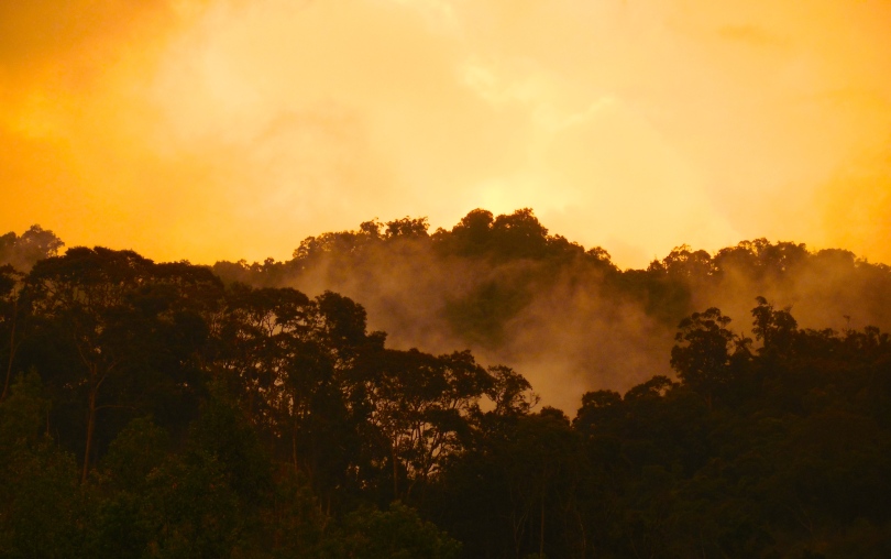
In this show there are several main elements: the airplane, the jungle, the island, etc that work as contexts of those paradoxes.
The paradox can be created with a context of nature, a natural uncontrollable force (which is the island and all that it involves) and the humans as intruders (Dharma). This contradictions can be represented through typeface, stock, etc. That feeling of "this doesn't belong here" like it happens through the series is what the design intends to convey. Although, this shouldn't affect the consistency of the design. There needs to be a visual harmony and aesthetic too. Maybe making a jungle look like it's made of electromagnetism (an element that plays a great role in the series) will show different elements of the series working together creating a visual paradox. Or maybe just the electromagnetic waves as a metaphor of what the island is.
Here's a tutorial of how to make these waves in photoshop. It's interesting to see how this kind of effect has been used with tunnels to represent time travelling in different games and movies, which is also something that happens in the series:
Other considerations:
Dharma designs
Dharma designs
Polar bear in the jungle
The first approaches were geometrical and trying to include these waves in such way that conveyed an anomaly related to energy in a place.


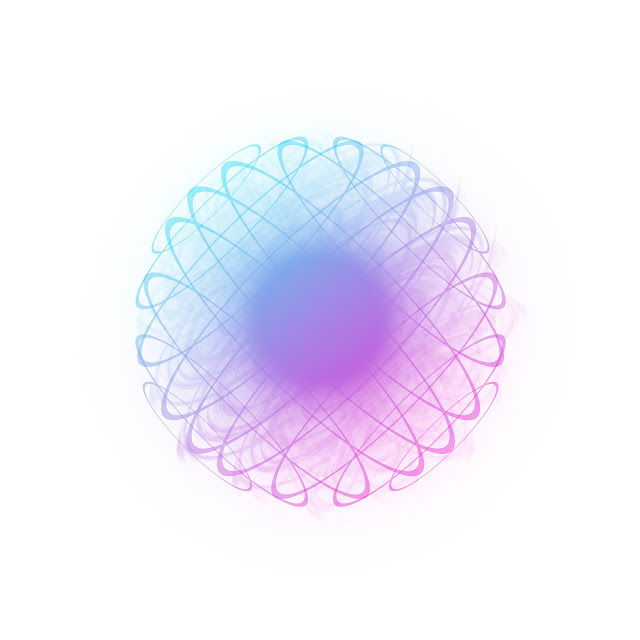
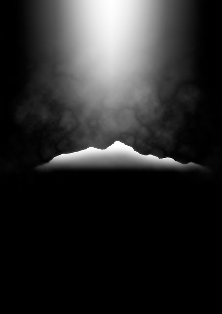
Trying to find a type of mysterious energy fit in the shape of the island the design seemed to work with the background of a nebula: a metaphor of everything we don't know about, the mysteries of the universe. I made a nebula following this youtube tutorial.
I added smoke to the island (the black smoke is one of the most important features of the show if not the most) and the airplane crashing. The texture of the nebula fades out towards the top of the smoke cloud, showing that not everything about this island is beautiful and marvelous. The island also fades out a little on the bottom to make an effect like it's merging with the sea.
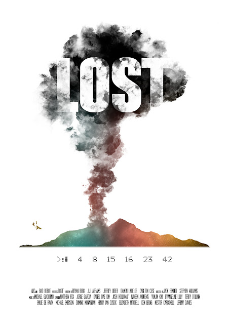
In this poster, the title is interacting with the illustration in the same way credits could be interacting with animation in title sequences. The still image limits the design and pushes the names of the cast out of the smoke. Someone suggested to include the names of the cast in the smoke as well, but it would result on a congested design. The whole poster could be covered in black smoke with the names popping out here and there, but that would make the concept much more simpler.
The white background allows the design to standout more with its different colours as well as giving a sense of isolation of the concept.
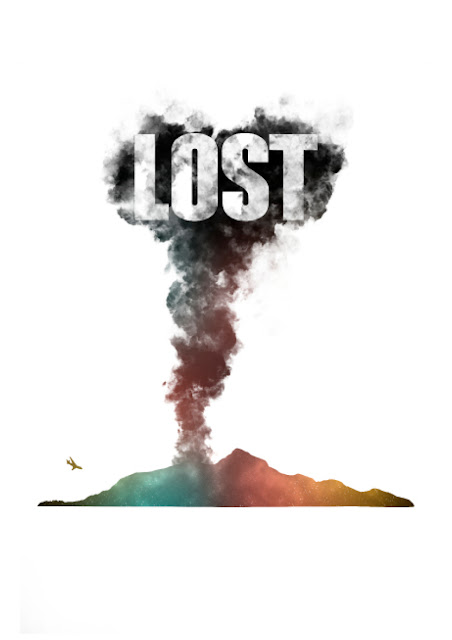
I also added those numbers right below the island as they play an important role in Lost. The typeface for the title is the same as the original series (there's no reason to change it for the purposes of this design) and the one used for the numbers is "ScreenMatrix", a typeface that reflects very well the aesthetics of old DOS systems (also related to the plot, as these numbers had to be introduced in an old computer).
The type used for this example for the names has a very standard film context, which is probably not what it should be considering that this poster is about title sequences.
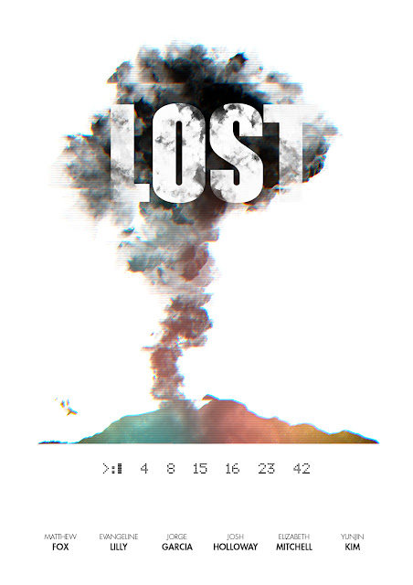
Nevertheless, as pointed out before, using this concept in an animation names could be easily used in the smoke, so it seems pointless to try to drag the attention from the smoke in the poster. Also, what is important in a poster like this is the title of the show. So then, the names of the cast are included using a typeface (Futura) that denotes rationality and civilisation in opposition to what the island represents. This kind of typography is also used in Dharma packaged products in the show. In order to take the concept further and to enrich this "conceptual animation" the design is added an effect of electromagnetic interference, which is also a very important aspect of these series. This is done by distorting the illustration and giving some slight chromatic aberration to it. The thin lines are there to convey a kind of old CTR monitor, as one of the ways the main characters learn about the secrets of this island through VHS tapes.
Someone told me that it's confusing to see the airplane that is about to crash and the smoke coming out like that. That is also done on purpose to enhance the confusion and to challenge the logic in a very simple way.


Trying to find a type of mysterious energy fit in the shape of the island the design seemed to work with the background of a nebula: a metaphor of everything we don't know about, the mysteries of the universe. I made a nebula following this youtube tutorial.
I added smoke to the island (the black smoke is one of the most important features of the show if not the most) and the airplane crashing. The texture of the nebula fades out towards the top of the smoke cloud, showing that not everything about this island is beautiful and marvelous. The island also fades out a little on the bottom to make an effect like it's merging with the sea.
In this poster, the title is interacting with the illustration in the same way credits could be interacting with animation in title sequences. The still image limits the design and pushes the names of the cast out of the smoke. Someone suggested to include the names of the cast in the smoke as well, but it would result on a congested design. The whole poster could be covered in black smoke with the names popping out here and there, but that would make the concept much more simpler.
The white background allows the design to standout more with its different colours as well as giving a sense of isolation of the concept.

I also added those numbers right below the island as they play an important role in Lost. The typeface for the title is the same as the original series (there's no reason to change it for the purposes of this design) and the one used for the numbers is "ScreenMatrix", a typeface that reflects very well the aesthetics of old DOS systems (also related to the plot, as these numbers had to be introduced in an old computer).
The type used for this example for the names has a very standard film context, which is probably not what it should be considering that this poster is about title sequences.

Nevertheless, as pointed out before, using this concept in an animation names could be easily used in the smoke, so it seems pointless to try to drag the attention from the smoke in the poster. Also, what is important in a poster like this is the title of the show. So then, the names of the cast are included using a typeface (Futura) that denotes rationality and civilisation in opposition to what the island represents. This kind of typography is also used in Dharma packaged products in the show. In order to take the concept further and to enrich this "conceptual animation" the design is added an effect of electromagnetic interference, which is also a very important aspect of these series. This is done by distorting the illustration and giving some slight chromatic aberration to it. The thin lines are there to convey a kind of old CTR monitor, as one of the ways the main characters learn about the secrets of this island through VHS tapes.
Someone told me that it's confusing to see the airplane that is about to crash and the smoke coming out like that. That is also done on purpose to enhance the confusion and to challenge the logic in a very simple way.

Wednesday, 5 April 2017
Draft feedback + response
In order to improve the written work, tutors suggested that a good way to improve it would be adding some primary research, like interviewing a title sequences designer.
When I used the book "Uncredited" for the research of the topic of title sequences, I found out that the two authors of this book were Spanish like me. I saw this as an opportunity to establish professional contact, which has allowed me to carry out this interview to Antonio Boneu, a film director expert in title sequences and film theory.
Interview.
- Who you think is the most effective title sequences designer and what makes it so good?
I'm not used to answer to questions like that... I can't reduce the whole to a single thing, not even to the "10 best" and that kind of stuff you see on TV. I know too many sequences and I have my own criteria, which is not based on how fantastic a sequence might be,. It's also based in what the sequence aims to be, and how appropriate it's for the film or series.
Obviously, I like Bass... but not always. Same with Ferro, Binder...
I think the most prolific designer and with bigger influence of history is Wayne Fitzgerald (he only designs title sequences). Pretty much the same with Dan Perry (I love Taxi Driver's, Raging Bull's and All the president man's). I firmly believe that the most important designers and also the less valued are Steve Frankfurt and Robert Brownjohn (To Kill A Mockingbird, Goldfinger and From Russia).
Sandy Dvore (my personal discovery) and Lardani (The good, the bad and the ugly) amuse me, but just that. I also like Juan Gatti and his collaborations with Almodovar.
I like Cooper when his ego allows me to like him and I like Karin Fong, Balsmeyer, Greenberg, Trollback, Lebeda, Deborah Ross, Dany Yount...
But if I had to choose one for their work as a whole, Jean-Luc Godard fascinates me... those are not title sequence, those are words on screen. The first 10 years of this director are overwhelming and everything is way over anything that has been already done. Pierre Etaix and his collaborations with Jacques Tati also fascinate me (Mon Oncle).
And to mention a plastic artist I adore all the work of Geoff McFetridge. Suicide Virgins and over all Adaptation and Where the Wild Things Are.
And I'm sure I am forgetting many other things...
- Since you pick McFetridge at the end, why do you think his work is so effective?
In my opinion McFetridge possess a higher level of implication, since he doesn't work as a designer. He does what he does due to his personal friendship with Jonze and they find solutions to problems of narrative packaging. The best example is where the wild things are, in which uses title sequences as subtitles. Typographic information in addition of the tone of voice (a 'musical key' style) works together with the way he manages to tell the audiences it is an independent or European film. And it is false. It is a movie full of stars.
Another way to improve it would be adding a further elaboration of the notion of paradigm/syntagm in relation to film. In order to extend that, I added a little paragraph with an example of an irruption of this relation. It can't be very detailed, since the essay already passed the 3300 words, which is more than 110% of the words required.
"This is similar to when a third party cut the title sequences out (a common practice on public TV). It feels like a low-cost production. This is because title sequences can achieve more than just showing information about who is in the project" (Stanitzek, G. 2009, P.49).
Pitching your ideas / Feeding back
The three ideas discussed in the blog post Idea generation / prototypes were presented to get feedback.
The one that I wanted to do was the one that the others liked too. This is the Feedback I got from this session:
- Make a series of posters that work together.
- Make a poster with iconic elements of a film. E.G: Matrix numbers are an important part of the film and they are used from the very beginning.
- Use iconic typeface. E.G: Woody Allen's Windsor.
- Try to convey the excitement of moving elements in a still image.
This session was very useful to think about how this piece of work could be carried out. There are going to be designed 3 different posters, and each one of them will reflect the theories of title sequences in different ways that will be explained in detail in future blog posts.


Studio Brief 2 - Idea generation / prototypes
The following 20 Rough ideas for the practical work can be split in three groups: Branding, Title Sequences or a different type of work.
Branding
As Title Sequences is a way of branding, design a logotype of something different from a film following title sequences theories.
Brand different films creating a dissonance with Synaesthesia to explore the limits of this effect.
Title Sequences
Re-make the Title sequences of a specific film to re-interpret them and fully understand the process.
Make different title sequences creating a dissonance with Synaesthesia to explore the limits of this effect.
Advertise a product or service using this format to take advantage of the unconscious acceptance Title Sequences have in the popular culture. (Just an idea, but don't want to contaminate this form of art)
Title sequences designed in such way that merchandise can be made out of them. For example, instead of designing something very abstract, make something like the Pink Panther, a content that encourages to be reproduced in the real world.
Make gifs out of title sequences for background on film covers on digital platforms.
Title sequences of a book.
Title sequences of an indie film.
Title sequences for internet content (E.G: Youtube channel, anonymous shortfilms, etc).
Title sequences for Virtual Reality
Other works
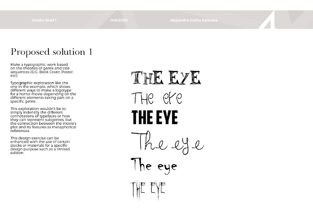
Make a typographic work based on the theories of genre and title sequences (E.G: Book Cover, Poster, etc)
Make a series of posters of specific films that can justify a use of a dissonance with Synaesthesia.
A series of posters based on the theories of title sequences.
Design typeface/s for genre/s
Animation to create atmosphere for those getting into the cinema. (Pre-film)
Make a series of posters using metaphores that summarise a key fact of a film.. This will allow more experimentation with different films and genres in the use of typeface/background in a graphic design context
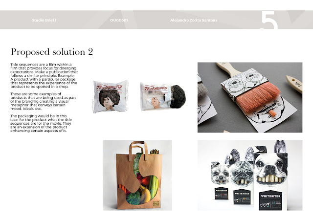
Packaging design of a product/film based on title sequences theories.
Title sequences are a film within a film that provides focus for diverging expectations. Make a publication that follows a similar principle. Example: A product with a particular package that represents the experience of the product to be spotted in a shop.
Use a dysfunctionality of audience seeking entertainment in other emerging disciplines to find a canvas to add depth of meaning. (Note: time should be involved in order for this to make sense, as publications that are not subject to time the undesired parts can be easily skipped)


Subscribe to:
Comments (Atom)


